I was sorting through some work I did during Spring quarter and despite taking about twice as many units as anyone else I knew (and more in the case of a few people), I managed to churn out a few kind of interesting ideas.
I’ve been thinking about how to determine which graduate schools I should apply to (among other things that might come out in the next few months as I get more time to reflect and write), and one of the things that came up was that I needed a good way to assess the quality of a department according to some criterion (or criteria). Academia has already taken a shot at that with this score aggregation formula called an h-index or something like that. It seems to bring together freshness, impact, and other factors to come up with one reasonable number for each individual faculty member.
The problem was that this didn’t provide a good insight on the university as a whole, and even where you could aggregate everything into one descriptive statistic, it was still questionable whether it was an accurate estimation of the university’s quality, which is something you just kind of feel. So in the same way that you might determine that a polygraph test machine wasn’t right because it wasn’t identifying liars as much as it was identifying people who were ashamed of what they were talking about (or otherwise uncomfortable, and thus exhibiting traits mistaken for liar’s traits), I wasn’t sure that the h-index was an accurate measurement itself. But to tease that out, I’d need to visualize that data in a way that made inconsistencies pretty glaring.
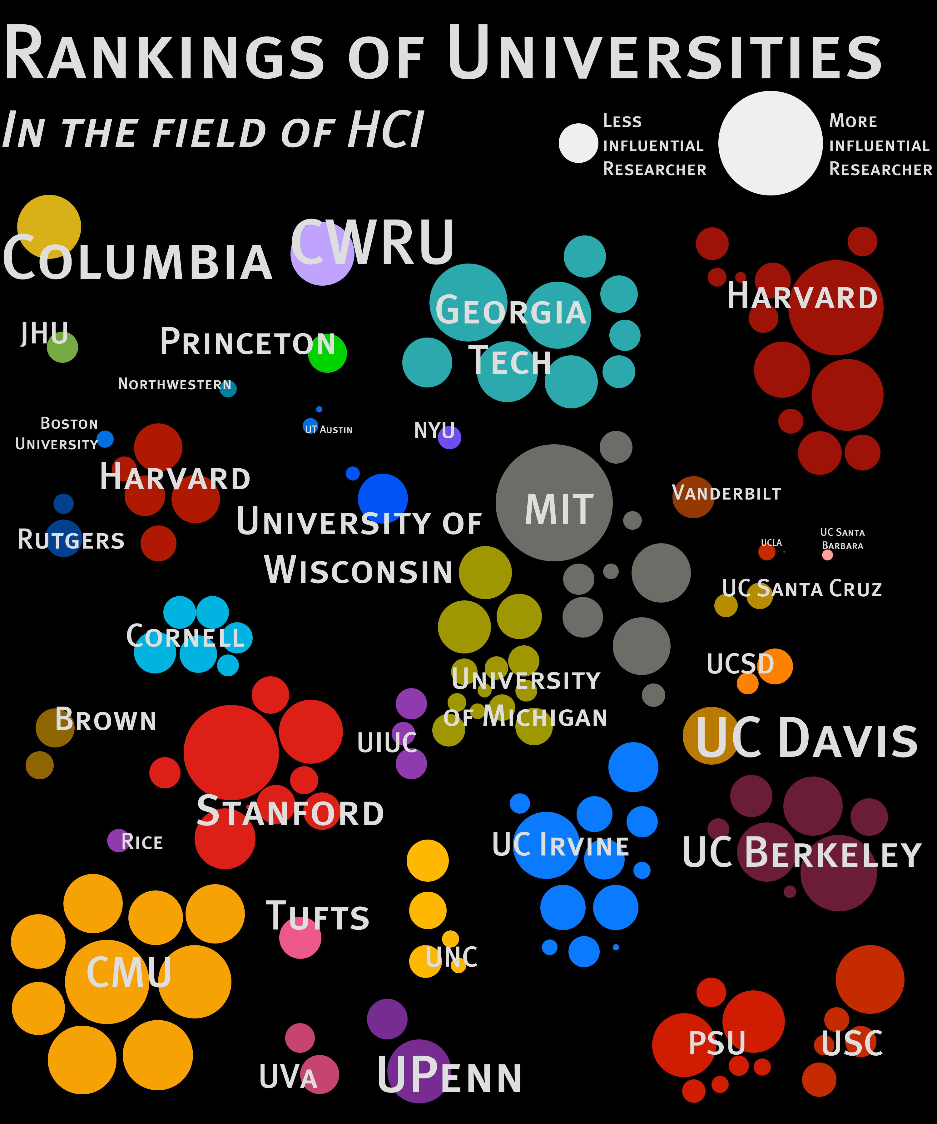
I came up with this illustration. It’s a very visual way of viewing information which I hoped was a little more informational than… well, any array of numbers could be. You can see how many people are at a university and what level of impact they seem to have on the community as a whole. As a clever little idea, I used the overall average to determine the size of the name next to the university; Harvard’s name would be much bigger if the plethora of researchers they had were as big names as the 2 or 3 who otherwise dominate their faculty. Same with Georgia Tech. Columbia and CWRU have disproportionately large names because their 1-member faculty produces an average that is entirely dependent on them. That one person does well and it looks like they’re more impressive since “their entire faculty” has a significant impact in the field of HCI. Not very fair.
I also made one for CSCW, which showed a more diverse group when you look at this different focus:
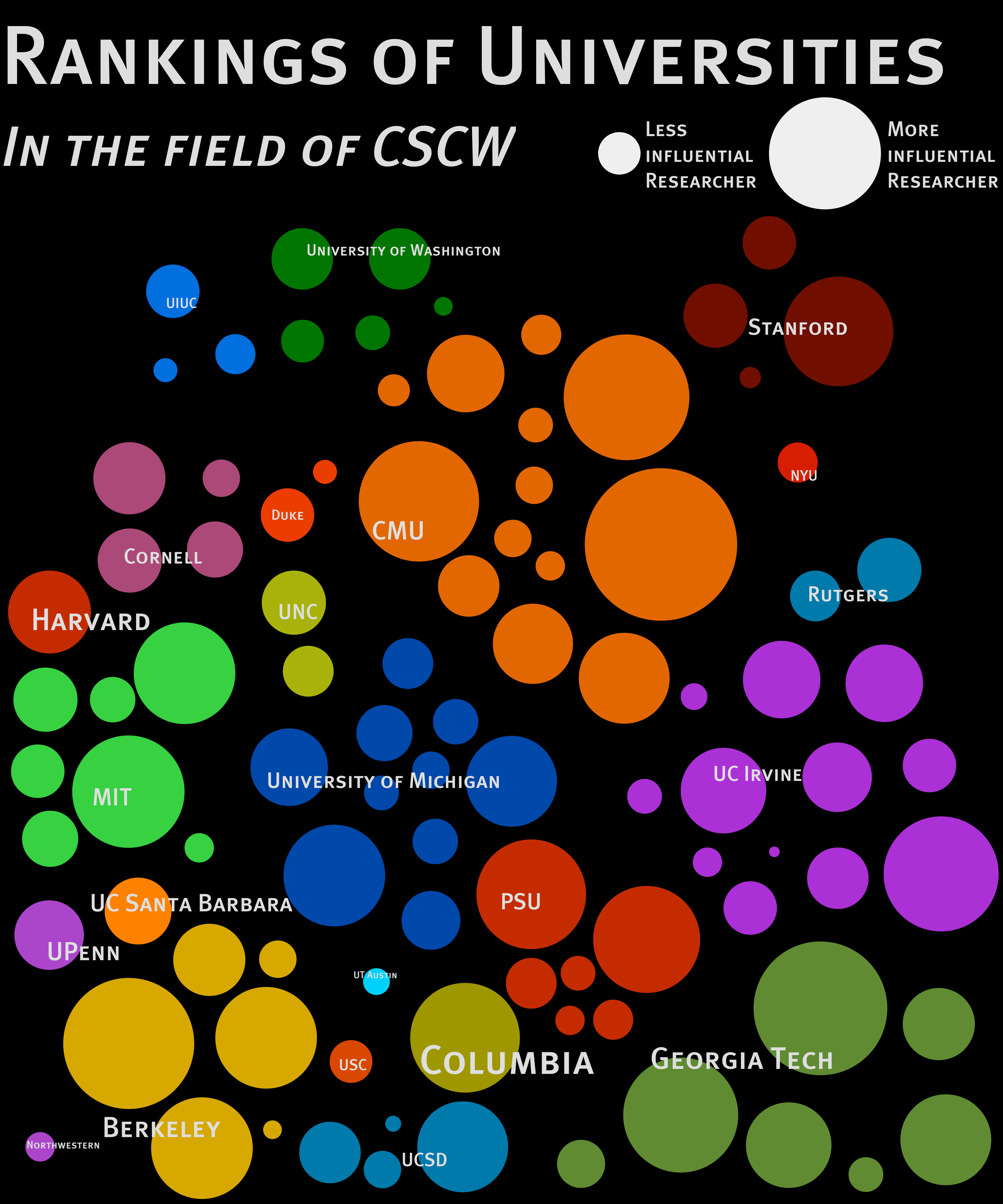
I was interested to find that relatively few universities got inflated reputations (except maybe Columbia and Harvard), and there were a lot of universities with a few “rock stars” surrounded by, er… dwarf stars, I suppose.
I’m not sure if the h index is a bad way to assess the quality of a university’s researchers, but it’s certainly good to get a grasp of the university through a given metric in a quick and intuitive way. There are big fish in academia and if we can assess a field at a glance and see that something is just “off”, we can tell that we need to rework the formula we’re using to formalize the quality of the institution. If someone sees all this and thinks “woah, [some university] shouldn’t be that [big/small]” just from glancing at it, that tells us to keep looking for a good indicator.
Or set of indicators.
Or to give up and just trust the poison chicken. Anyone got any strychnine?