It’s April 2020. There’s a pandemic sweeping across the world, and many of us are basically locked in our homes reading the news and consuming visualized data about infection rates, mortality rates, charts telling us what trajectories we’re on in comparison to other countries around the world, and trying to make sense of the magnitude of the trouble we’re all bracing ourselves for. One of the pernicious, kind of evergreen problems in HCI - or more accurately in data visualization - is how to communicate really out-of-scale data in a way that doesn’t totally lose the person trying to grok what’s going on. That’s sort of the whole point of data viz, after all, isn’t it? So this paper - “Du Bois Wrapped Bar Chart: Visualizing Categorical Data with Disproportionate Values” by Alireza Karduni, Ryan Wesslen, Isaac Cho, and Wenwen Dou - was really timely; this paper offers a historically inspired data visualization tool that (at least in some situations) helps people juxtapose bits of data with wildly different values in a way that doesn’t totally lose all meaning.
Data Viz work scratches an old intellectual itch and I tend to enjoy fundamentally simple, but insightful, attempts to expand the language we use to convey things visually (on some level, haven’t we been doing that since the first cave paintings?) This paper had a few of the keywords that really intrigued me - one being that representing categorical data is kind of fraught because sometimes comparing them is problematic, so you have to be careful about how and when you represent them together.
But the more salient bit is that disproportionate values part. This is really hard, and particularly relevant these days with the pandemic making its way through our communities at alarming rate. Kenneth Chang wrote about this for The New York Times here, but the basic idea is that we need better ways to represent orders-of-magnitude differences in values in a different way from linearly, because it totally eclipses the smaller values to represent the larger ones. There are issues with log scale, though; Nate Silver talks about one of them - that it compresses some information at formative stages, for instance. He outlines other issues in other tweets, but the point is this isn’t one of those things for which there’s a clear “right” answer.
Anyway, the debate about log scale isn’t the central point I want to make here.
Another part of this paper that piqued my interest was the inspiration they took from old historical data visualization created by W.E.B. Du Bois. The basic idea is to digitize this format where you wrap a bar chart. It’s a neat trick that evokes something familiar (everyone’s seen a bar chart) to convey something hard to get (disproportionate values). From their paper, figure 3:
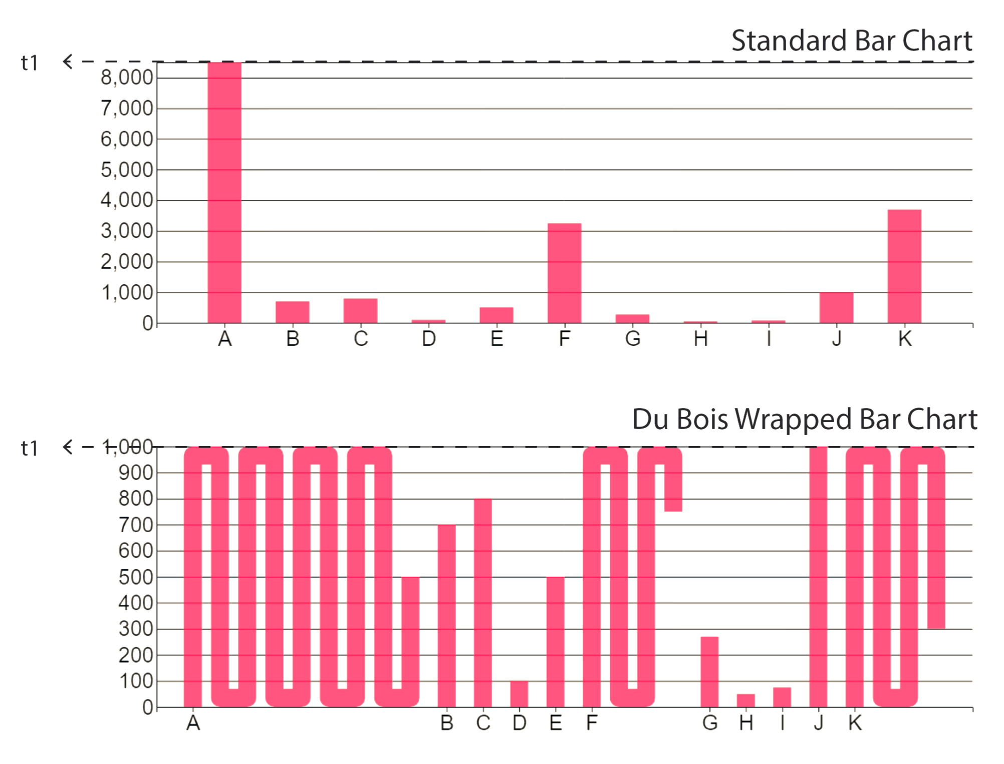 Top: Standard bar chart. Middle: Wrapped bar chart at full length. Bottom: Wrapped bar chart at half length. Color choices for the bars and background are adopted from Du Bois’ work
As I was reading the paper, I found myself thinking about the idea of drawing a tally - you draw four lines and then you draw a diagonal across them to represent five. It gives you a shorthand so you can scan the chunks of “four lines with a diagonal” and say “okay, those are fives”. We have reasons for preferring base 5 in that context (or base 20 in others), but for things that scale the way they were evaluating, I got the sense that they had to be more responsive to what the situation calls for (or arbitrary, if you’re not feeling charitable) with regard to the scale - that is, at what level things wrap. I think this is what caused issues for participants who - it seems - were stuck sitting there counting how many wraps there were when the wraps happened too often. But maybe you could do something like a weave (horizontal wraps along with vertical) to sort of convey denseness or magnitude or something. I dunno. I’m not a data viz person lol.
The results don’t shock me - Karduni et al found it was great in some contexts and in some ways, but frustrated people in some contexts in other ways. In my mind, a tool that has an opinion about where it doesn’t belong is at least on the right track, so it’ll be interesting to look for disparate values and opportunities to use this tool if the situation fits. If someone wants to adapt a covid-19 data visualization to use wrapped bars, let me know - I’d love to see and share it.